de Velde
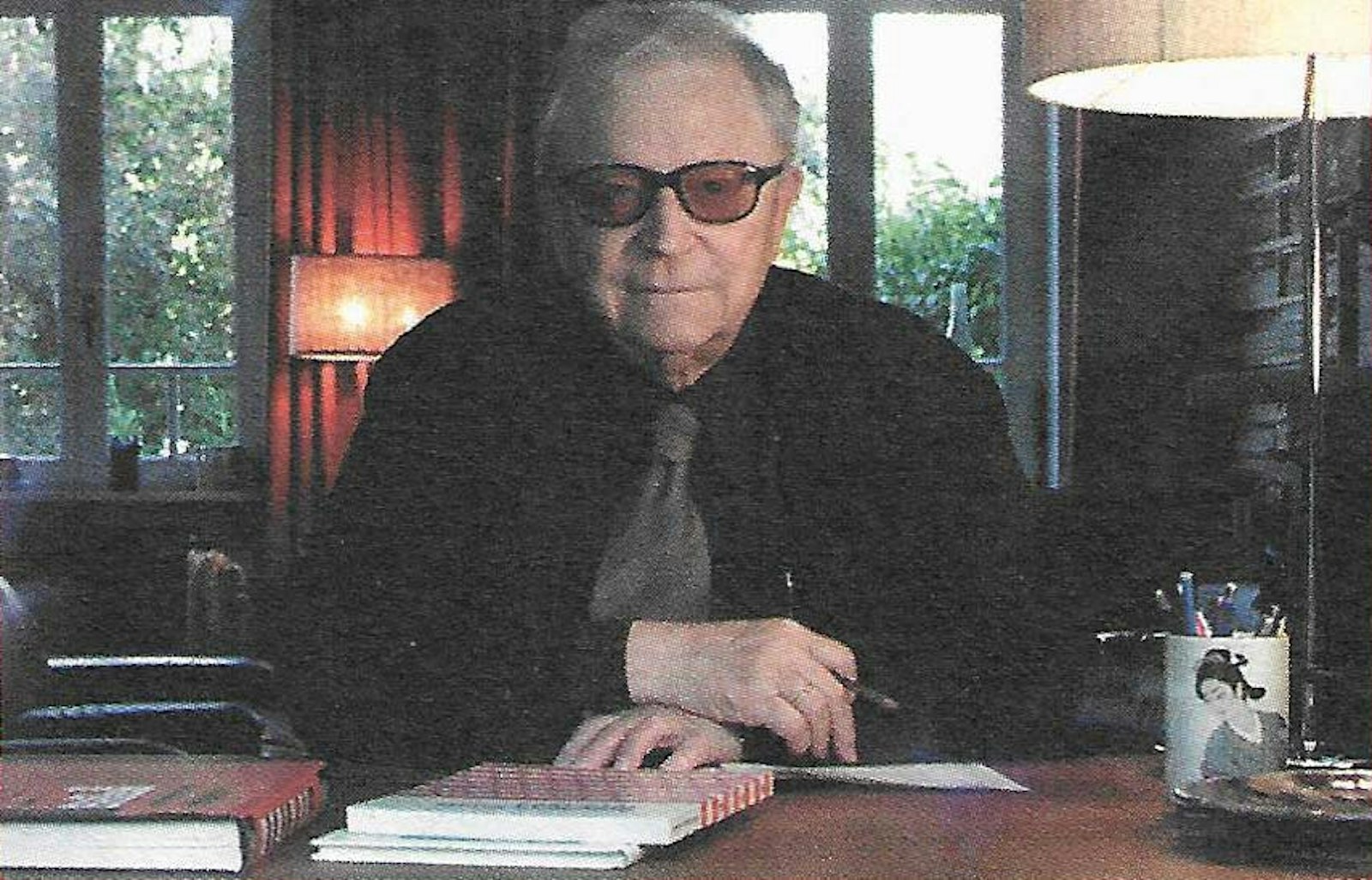
Fernand Baudin
Our western alphabet has not yet deteriorated to such a state that it has to be protected like our monuments and cathedrals. Writing is indeed still not obsolete.
We use it everyday in a thousand forms yesterday on the typewriter, today in our own handwriting and tomorrow on the computer. Especially on the computer, writing is present in many ways and many forms and it appears to be the main actor driving all other players to the background. Instructions for writing are not incorporated in the computer and the correct use of writing is left to the user or owner. Now we can all play writer even though we have not been trained to do so.
We ore all orphans but in front of the computer we feel at home. Things you cannot find can be developed gradually through experience, as you work or by researching and reading. You are able to study your own creations, compare them with similar work from various places, by other authors and with work from other times.
Alternatively you may want to consult the user instructions and the sharp tool of criticism of Fernand Baudin (°1918). He presents them to us in a variety of forms, including discussion forums, speeches, contributions in trade magazines and newspapers, in encyclopaedia (for example La chose imprimée), in his own publications and dossiers, in letters and of course in the careful design of his books.
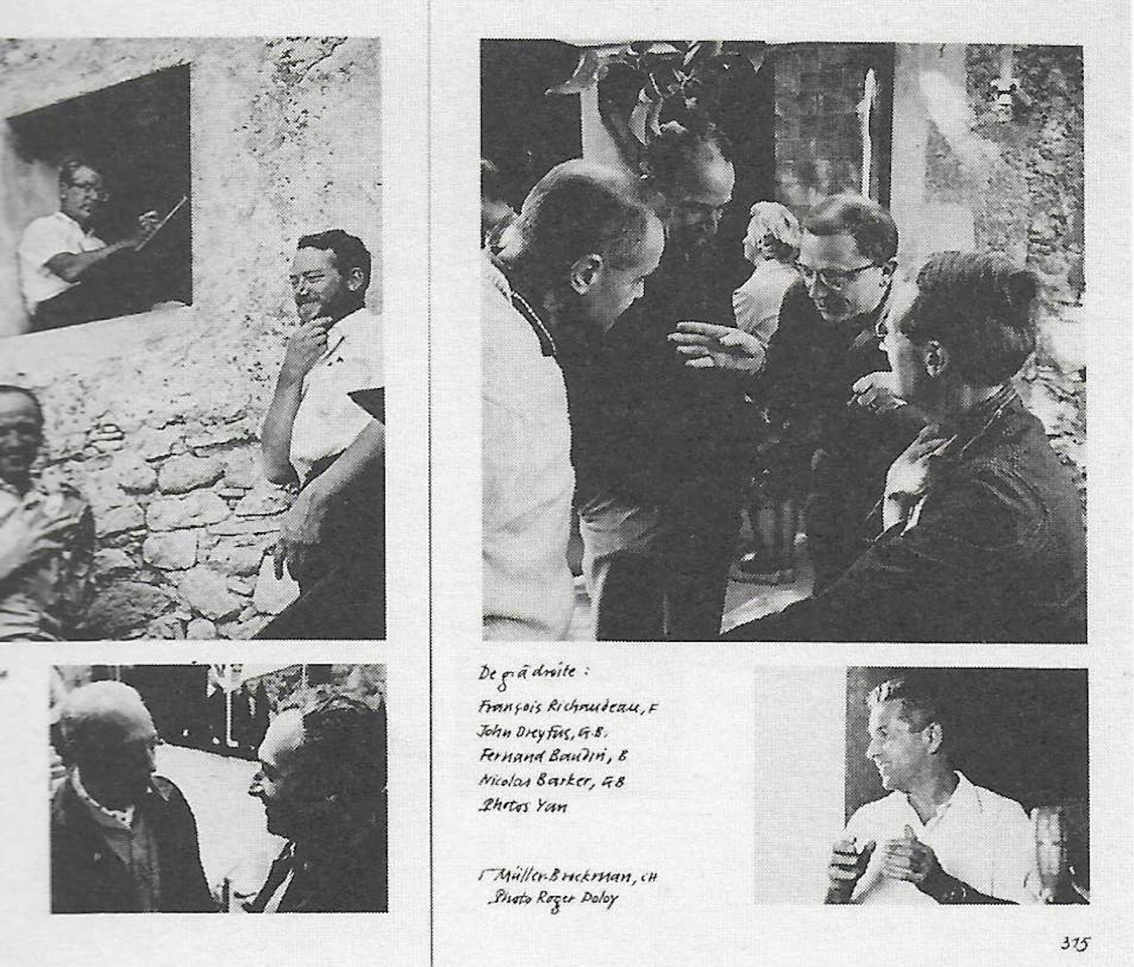
Early in his career he travelled from Ghent to Brussels, from Brussels to Antwerp, The Hague, Haarlem, Amsterdam, Sankt-Gallen, Zurich, Basel, Munchenstein, Lausanne, Frankfurt, Mainz, Munich, London, Macon, Paris, Lyon, Lurs-en-Provence, Parma, New York (where he was invited in 1978 to hold a lecture on Christophe Plantin at the New York Public Library for the Typophiles of New York), San Francisco.. to exchange experiences with book restorers educators historians and publishers and discuss new techniques and developments and study source material in local libraries. He wanted to do this in the most direct fashion and not through the eyes of intermediaries.
He always returned from these graphic arts breeding grounds with inspiration to write a new dossier, to teach, to initiate new projects, to organise a convention and of course to carry out typographic assignments which required his attention. He never stayed in one place for more than ten days and always returned to brief us and himself. For this reason, his graphic art is not branded with national signs and even less with international traits or doctrines referring to schools whatsoever. He is never satisfied with ready- made solutions and his work is always the fruit of conscious choices.
His work always grows from within the essence and is determined by the subject matter, the objectives of the authors, the target reader, the reading conditions and the financial and technical means made available by the commissioning party. To expand on the latter I would like to quote the following passage from his publications "With regard to ideas about type, the decision has always been taken by the sponsor. However; how correct is the judgement of the latter? Does he have brains or money? And, what is the purpose of a talented designer if the commissioning party has insufficient funds?" (in Chris Brand 1996). His efforts ultimately crystallise into a graphic object, often a book that is clearly European and definitely BAudin.
How does the reader perceive this product? Handy, user-friendly but not condescending, matter-of-fact in an unusual way, defiant but unobtrusive, often stark and always with determination. Textual as well as visual, is work must fit together as a whole and as Gestalt. A finished product that ultimately goes its own way.
When Baudin begins to write he does this abundantly and determined. The reader immediately grasps the underlying message: the irrepressible urge to enlighten and create cohesion in the chaotic communication processes of today. He develops his ideas by analysing centuries of western writing culture and connecting aspects from the present to the past and vice versa. His final objective is to present us with the tools that, in his opinion, everyone should have at his disposal, i.e. minimum visual grammar directly linked to language grammar. This must be acquired through formal training or self-study.
Reading through his oeuvre, you often encounter his principal arguments, for example "II est bon de savoir; que l'espacement est a l'ecriture controlée, ce que le silence est a la parole articulée", highlighted from various points of view and embedded in the most recent developments and facts. In his own words, facts are more persistent than their explanation. Another quote: Good letterspacing may save a banal typeface; however; the wrong spacing may destroy a beautiful typeface. Why should we be concerned? In order to respect the intentions of the author and to increase the level of legibility for the reader? You will often encounter his systematic disapproval of generally accepted standpoints which have been around for centuries and which he questions.
For example, a single sentence by the respected French philosopher Jean-Jacques Rousseau was commented on by Baudin in a ten page document. His reply, pertaining to the fundamental subject of the education of writing, was 225 years late but still relevant and of democratic importance (in Liber amicorum H.D.L. Vervliet 1988).
This was also the case in the controversy with the American authority M. McLuhan in 1969: he wrote a sarcastic article with the title La methode jésuite de M. McL which was published in his own refreshing design. At the same time he haphazardly refers to striking and seemingly petty details such as ... "ceci pour vous rappeler que la monumentalite est affaire de proportions et non de dimensions ..." (in l'effet Gutenberg 1994, page 266). However, it is sometimes difficult to read his thoughts but his ideas do deserve our attention.
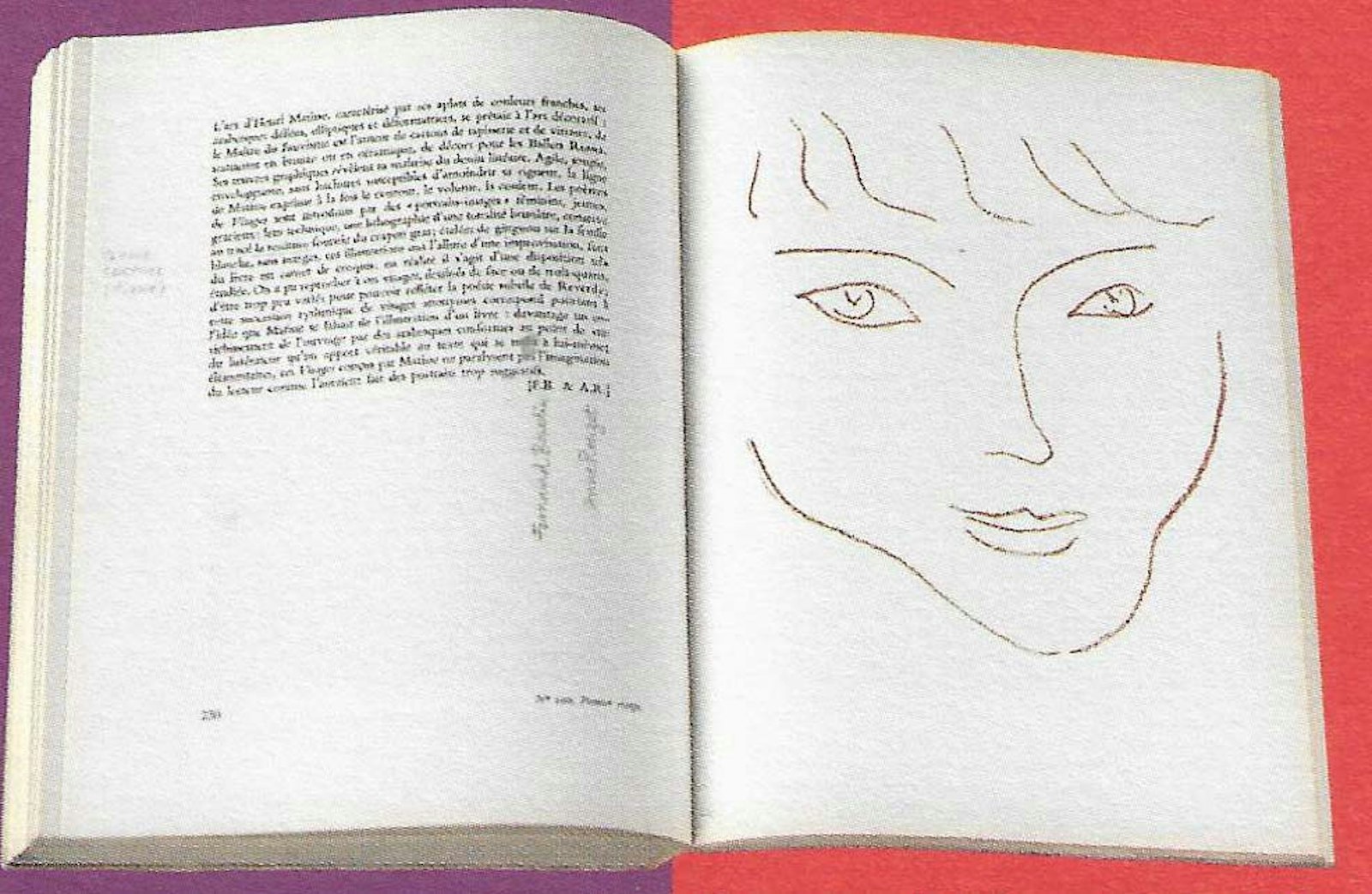
In 1956, Herman Liebaers who at the time was head curator of the Royal Library in Belgium, entrusted Fernand Baudin the visual publications of the institute. This assignment included a series of books, posters, brochures and catalogues. The latter soon became famous. Once again he was not only concerned with the pure design aspects but also formulated suggestions for the scientific writers. In some instances he is credited as co-author. The review of the book Visages by Henri Matisse and Pierre Reverdy is an example of how he re-positioned the visual publication in the centre of the cultural biotope (in cat. La réserve précieuse 1961).
For this catalogue the head curator chose a somewhat lavish format while the designer would have preferred to use a more economical and handier size. He did succeed in doing this for several ther catalogues. Recently I bought a small book to which I was attracted by the naked simplicity of the cover. I expected to discover the layout by a young fellow craftsman who stubbornly dared apply this stylistic clarity. To my surprise the book was printed in 1969 and designed by the fifty-one year-old Fernand Baudin, in a 14,5 by 22,5 cm elegant format which deviated from the other catalogues.
In 1971, he was given the opportunity to visually revamp the most important paper of the country. This was the beginning of another adventure: the new director of Le Soir, Mr. Corvillain, requested a new look which could be inplemented without unduly shocking the readers, the editorial staff, the typesetters and the print shop. However, this did not prevent Baudin from blatantly suggesting o Jean Tordeur, the respected editor, that all typefaces in use should be relegated immediately to the forge for recycling. He only wanted to keep two typefaces, obviously in several well-balanced sizes and contrasts (from normal to extra bold). The numerous and fundamental modifications, including instructions for punctuation, were introduced gradually in stages and the new layout for the whole newspaper was finally completed in 1975. The only remaining modification then was the redesigning of the main title header. In the light of the fact that the newspaper's management did not think it was necessary to change the title layout he was only allowed to perform the work if the modification remained unnoticed to the reader and... if it was done for free. For this highly specialised task, Baudin paid his friend and typeface designer José Mendoza y Almeida. The new layout was used for about twelve years, until the newspaper converted to colour printing. The particular style with characteristic grouping of photos still comes to my mind. It was the result of a close working relationship between the designer and the various managerial levels within the company that made this possible and guaranteed a lively house style.
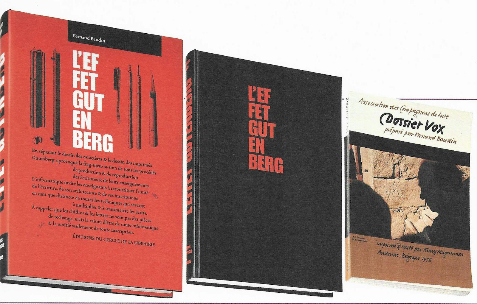
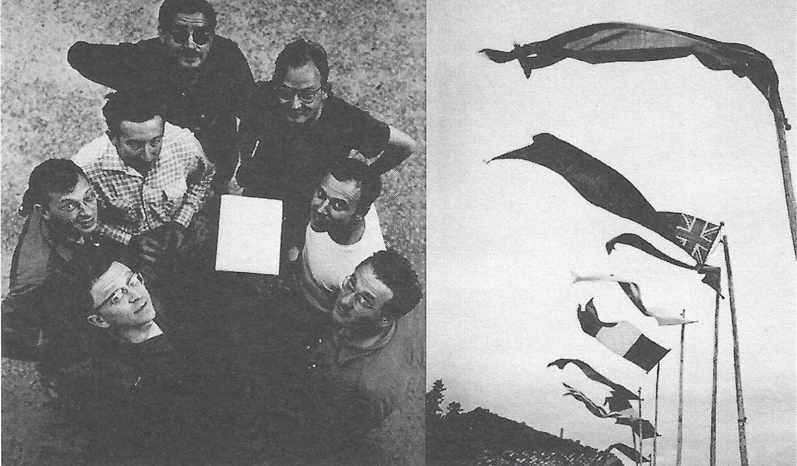
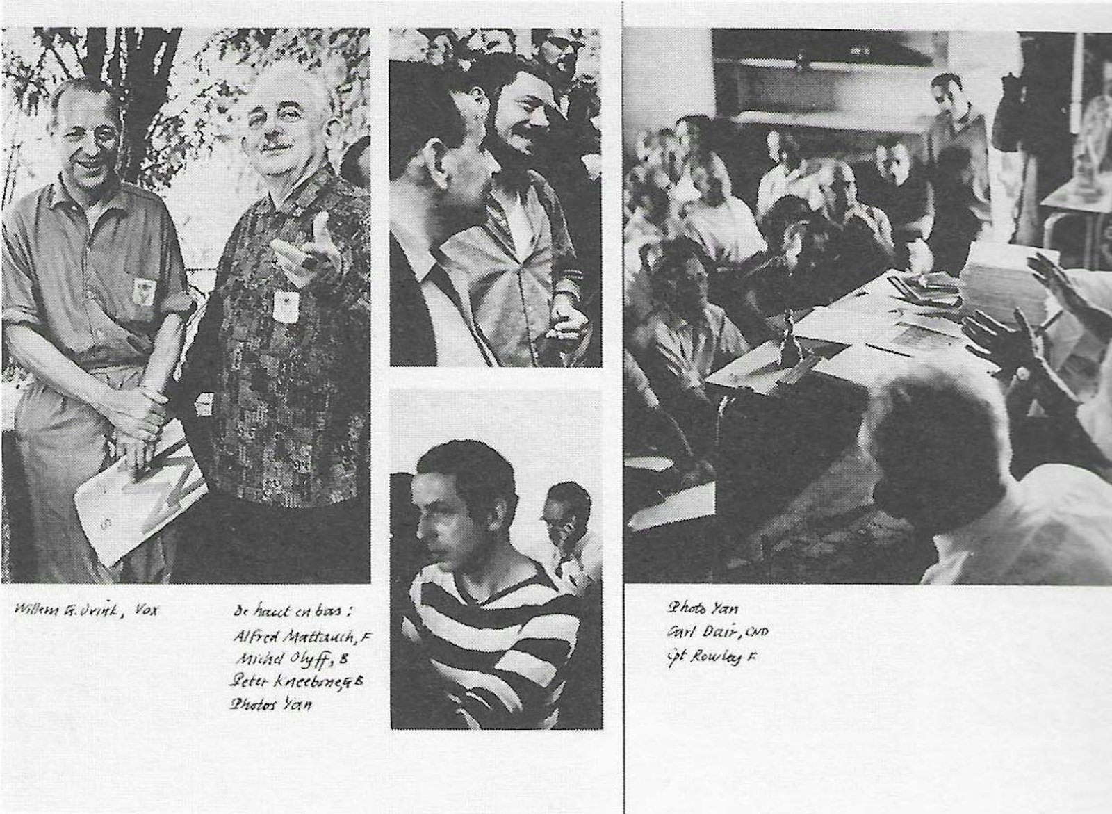
Although Baudin has designed exhibition stands, posters, spatial lettering, logos and other material, he considers himself to be primarily a designer of books - in the widest western-culture sense of the word. In his so-called dossiers, which were mainly written in co-operation with the Lurciens (prominent typographers from Europe and America who exchange their experiences each year in Lurs-en-Provence), we enter the field of research from a didactic point of view. In his dossiers Dossier mise en page (1972), Dossier A-Z (1973) and Dossier Vox (1975) you can actually feel Baudin's delight of writing and designing.
Long before Baudin was a teacher at Ter Kameren in Brussels and later in Antwerp, it was clear to him that learning conscious observation was a subject for all ages, beginning at primary school level and continuing up to university. His principal work, L'effet Gutenberg, mentions discussions with educational authorities and ministers at the highest level. At the outset he was hopeful but he often encountered incomprehension. Indeed, the entire handicraft circuit seems to be doomed to this contemptuous and sterile treatment.
The following is proof of his continual pedagogical activity: contacts with pedagogues such as Hermann Zapf (G), Gerrit Noordzij (NL), Chris Brand (NL), Rosemary Sassoon (GB) and Frans A. Janssen (NL); dossiers such as the above-mentioned; the booklet De Drukker (1965, an early application free line spacing in type, for the sake of constant word spacing); the book La typographie au tableau noir, published in translation in 1988-89 in London and New York with the title How typography works (and why it is important).
Fernand Baudin always pays careful attention to being understood clearly by as many readers as possible. This preoccupation also explains his aversion to terminology which is not relevant but also why he strives to enlighten new concepts, to master new techniques which describe and reflect the characteristics of a transparent application of text - universal and timeless. He also contributes to a clear understanding of how language works in general and the visual translation hereof in particular. In his opinion, everyone should in fact be capable of using language in an effective and orderly fashion, especially now more than ever, as we are all using computers on a general basis. The Dutch typographer Gerard Unger agrees with Baudin and speaks in terms of "the growing possibility of a typographic autarchy and the complete freedom of printing and expression (Terwijl je dit leest page 222)". In addition, Baudin stresses the quality and significance of form.
Let me tell you a story. Having graduated, I offered my services to several companies and obtained an interview at the Etablissements Plantin. The person I met soon explained that they did not require a second designer at that time and that he in fact was the company's designer. Then he asked me a few questions: "Have you heard of the magazine Autolijn? You must read it it's a goldmine. Have you heard of the book Zet het zo? You must read it. Have you heard of..." etc. It was typical of Baudin, he was always building bridges. This is how the controversies of Gerard Walschap and Willem Frederik Hermans became mingled with the professional literature I was reading at that moment in time. The booklet, Zet het zo! by Bernard van Bercum was written in a meticulous and scientific style and was exactly the guide I needed. The same feelings are evoked each time I read L'effet Gutenberg. His book is an impressive concentration of information, well-formed and written in an enthusing, ambitious and utterly personal style.
Femand Baudin publicly claims that he is not a calligrapher, historian codicological researcher, graphic designer, nor an artist and that his revelations are nothing new. At the same time he leaves those obsolete tools from the age of Typotropism behind him. I have never heard him say he is not a literator, translator, bookworm, bookrestorer, a practitioner or an artist for life.
