de Velde
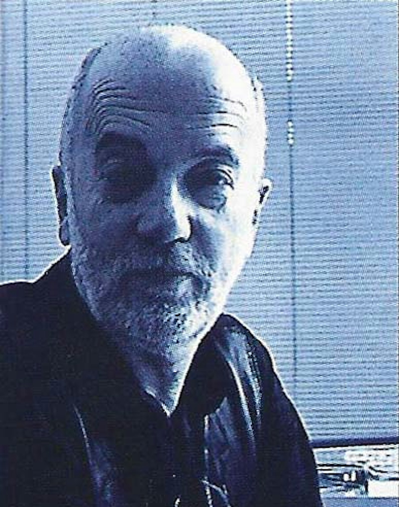
Rob Buytaert
In Rob Buytaert (°1936), we haven't chosen the most flamboyant of designers active in Flanders. No, he has won this acclaim through his very simplicity.
In the wake of the Bauhaus
His creations have to be good, legible (in particular) and fascinating by way of the illustrative material used, and yet still be the bearer of his own personal design signature. These cornerstones have become the foundations of a vision and view that did not always find expression in the past, but which he now has no fear about bringing to the fore where appropriate. Rob Buytaert detests poor things. They annoy him intensely. This makes him an honest partner to work with.
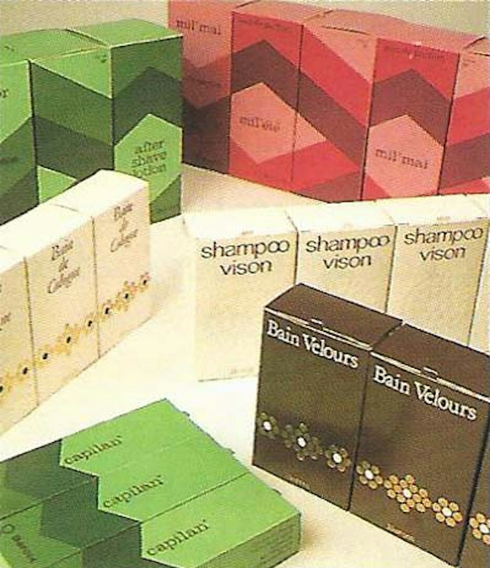
In 1961, he started his career as an independent graphic designer. Previously he had trained at St. Lukas in Brussels and particularly in the Academy for Industrial Design in Eindhoven; and a few people who taught in these establishments had a profound influence on his way of working and thinking. Karel Elno taught history of art at St Lukas Brussels and opened the window to the world of design for him.
He introduced him to the Bauhaus, to the American architects and to the design principle of 'Form follows function' amongst others. Again and again he has based his creations on this principle. And Buytaert feels perfectly at ease in today's design world, because the theories of the old trusty Bauhaus are once again in the ascendant for the current generation. It was a bit different a few years ago. A second figure who left a deep impression on his pre-professional career was René Smeets, principal of the Academy for Industrial Design. He was the man who could bring together different people from totally different backgrounds and produced fantastic results. Through this man, the young Rob got to know a teacher of catholic origin from the Southern Netherlands and a protestant design engineer from the Northern Netherlands, bath teaching in the same courses. What was wonderful about this was to have two people who talked about the same subject but approached it from two such different points of view that their visions sparked the students to do more than just study.
Rob Buytaert found a clear form in the Netherlands. He was trained there as an industrial designer, which probably explains his opinion of the designer as being 'in the shadow of the assignment'.
There are few, if any, industrial designers who feel called to step into the foreground. They also have little opportunity to work freely. That is why Rob Buytaert has 'an improbably high level of admiration' (sic) for Free Art. Ultimately he made a conscious decision to be a graphic designer rather than an industrial designer, because the former suited him better and gave quicker results. "An industrial designer can work for months, maybe years, on a project before the actual production starts, if it ever does," he says. It was therefore a conscious choice, but the industrial vision continued as his base: the analysing, the non-fashionable design, the search for synthesis.
In 1969, he, Rudy Verelst and Antoon De Vylder started up the Designteam. That Designteam was a dream. He wanted to do things with others. They wanted to design everything. Rob knew Rudy from his time in Eindhoven. Verelst was a product developer but above all an interior designer. Rob knew Antoon from the then professional association for graphic designers. All three respected one another, so that the structure of the business was very level, whereby the inevitable conflicts arose. The dream faltered, proved to be unrealistic and Rob went his own way. Later, after Buytaert had gone, Luk Mestdagh joined the Designteam and realised its most famous assignment with the design of the Borobudur exhibition. Buytaert remained active in his own business. He participated several times in group exhibitions in the Design Center in Brussels.
He started a joint venture with Luk Mestdagh, because they "complemented each other". "Luk is the critic, the cynic, the go-getter, the man with the distinct individual point of view, professional and with a good nose for business. I'm the same, but gentler and more friendly," he says. Finally, each went their own way, but they continue to share an office on the grounds of economy. In 1988, Rob received the Flemish Community State Prize from the then Minister of Culture, Patrick Dewael. It was a great honour for him, and totally unexpected.
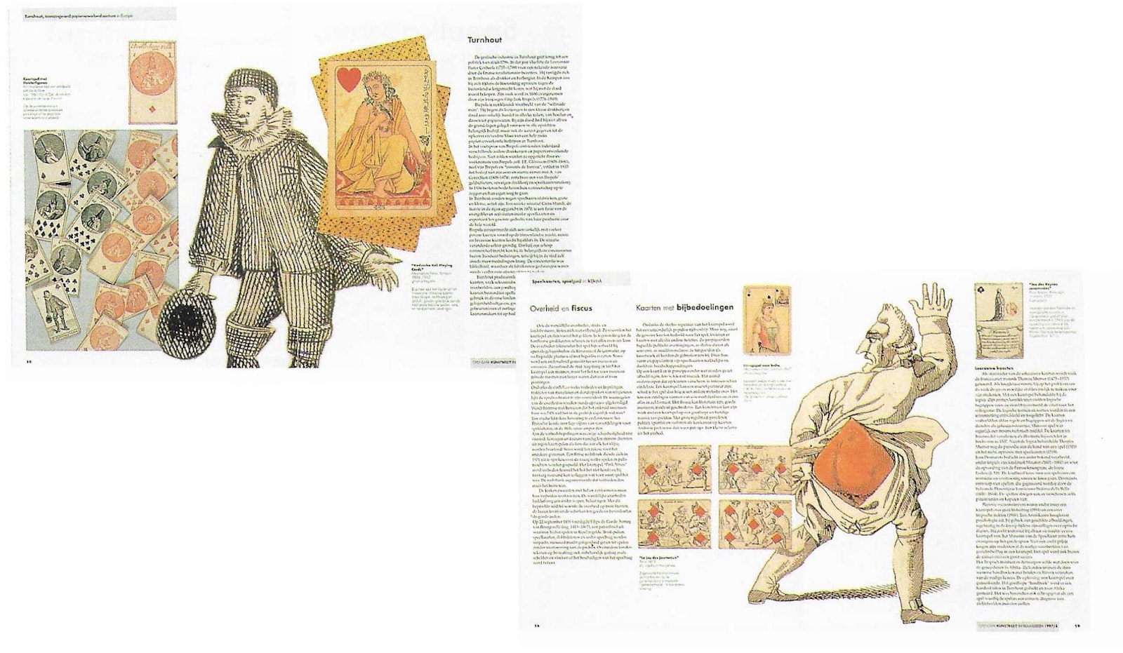
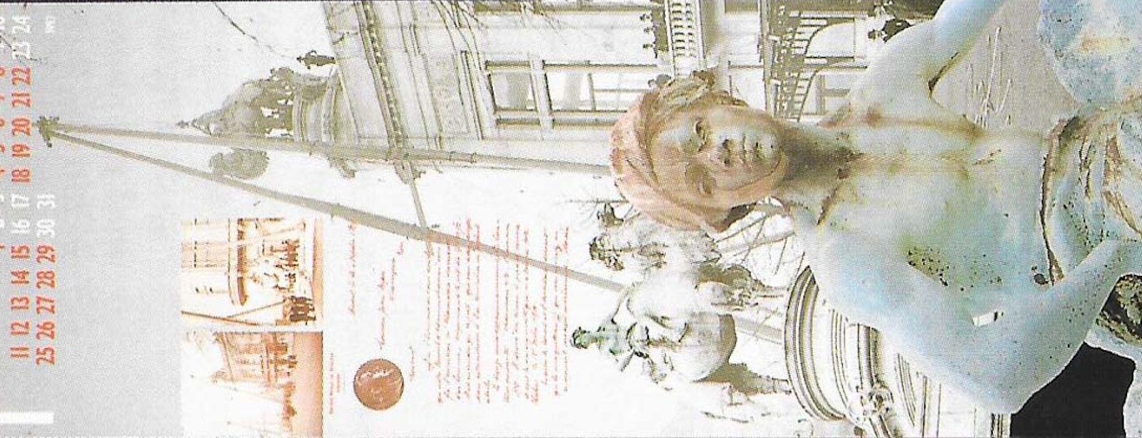
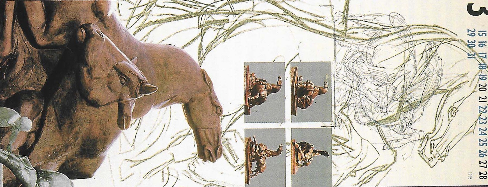
The works that he is most proud of are the calendars that he created for Antwerp Photogravure De Schutter, the magazine Openbaar Kunstbezit in Vlaanderen (Public Art Treasures in Flanders) and the posters for the ballet school. To him, a poster means using the whole space, making the subject clearly recognisable and, in particular, giving priority to legibility. The same with a calendar. Such a design starts from powerful illustrations, but the days have to remain clearly legible. It seems obvious, but this emphasis on legibility is frequently not considered important.
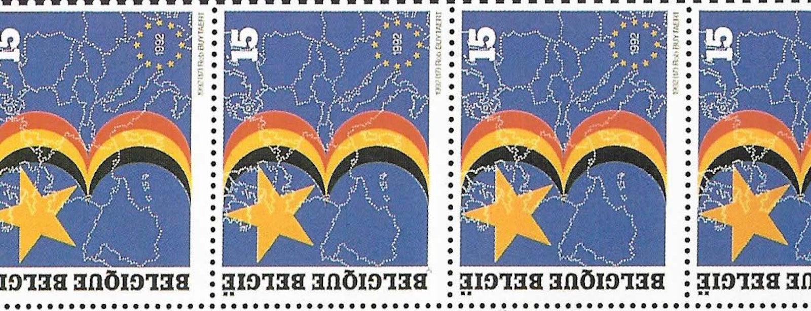
In Openbaar Kunstbezit in Vlaanderen strove for a structure that allowed for great freedom. He wants something more than just a 'neat' layout, and so introduces visually interesting elements and different dimensions. The illustration in a lighter frame under the text is evidence of such an approach. Another essential aspect is that the double pages came across properly when you open the page. Rob has designed tens of postage stamps, and has just completed a series of twelve that will be issued next summer. What they look like cannot be revealed yet, of course, but the work involves a complete sheet, and depicts ten years of European Monument days.
Rob Buytaert likes to work in a team; that much he has demonstrated in the past. lt is a non-variable in his way of working. He remains that way still. His employees have become his colleagues and he insists that we include them in this account, because many of the contemporary designs have also been created by Annemie Vandezande and Carl Cruysberghs.
