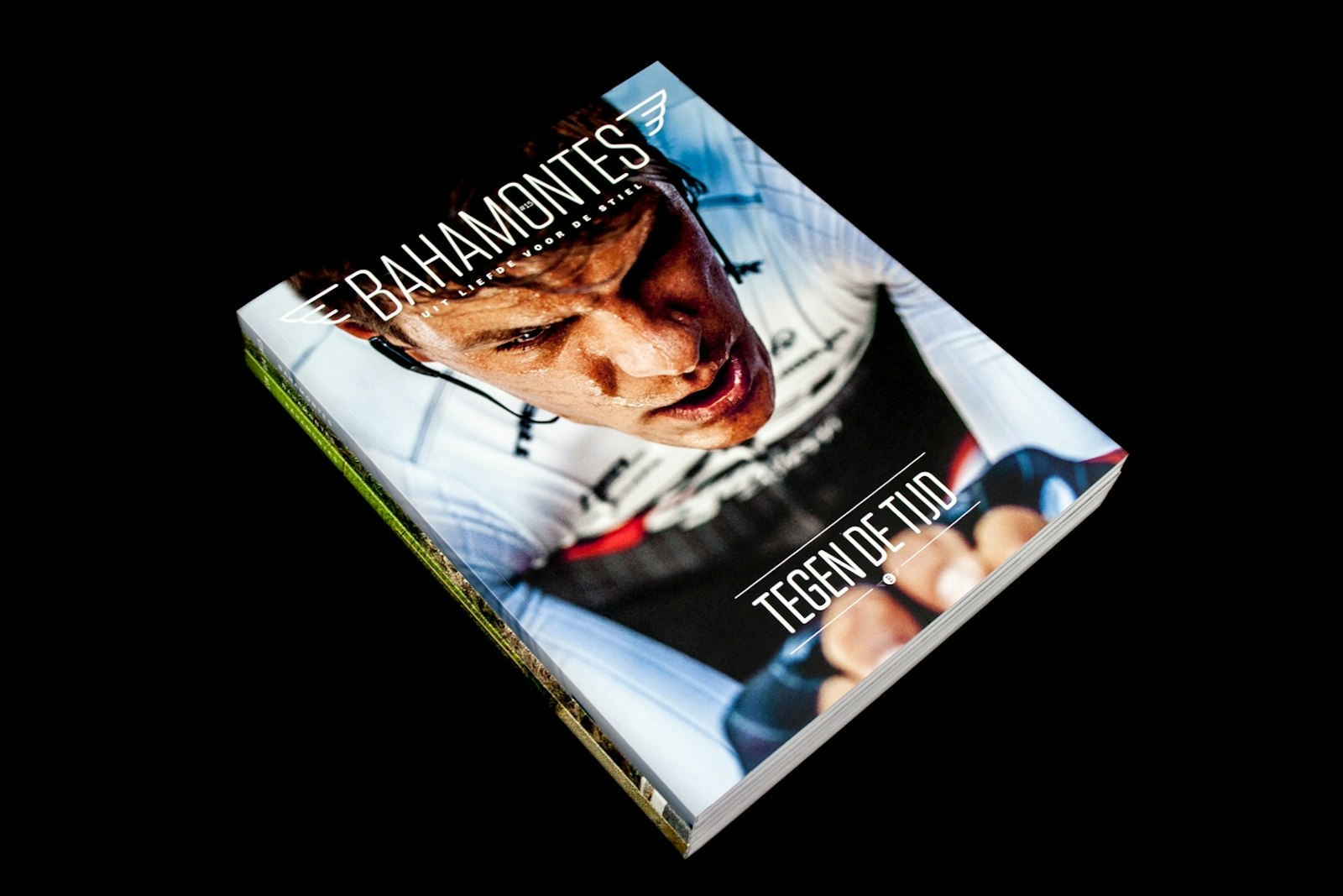
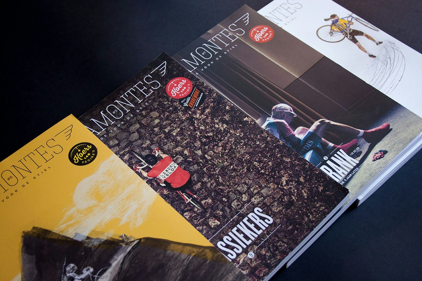
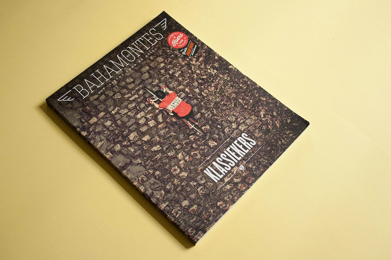
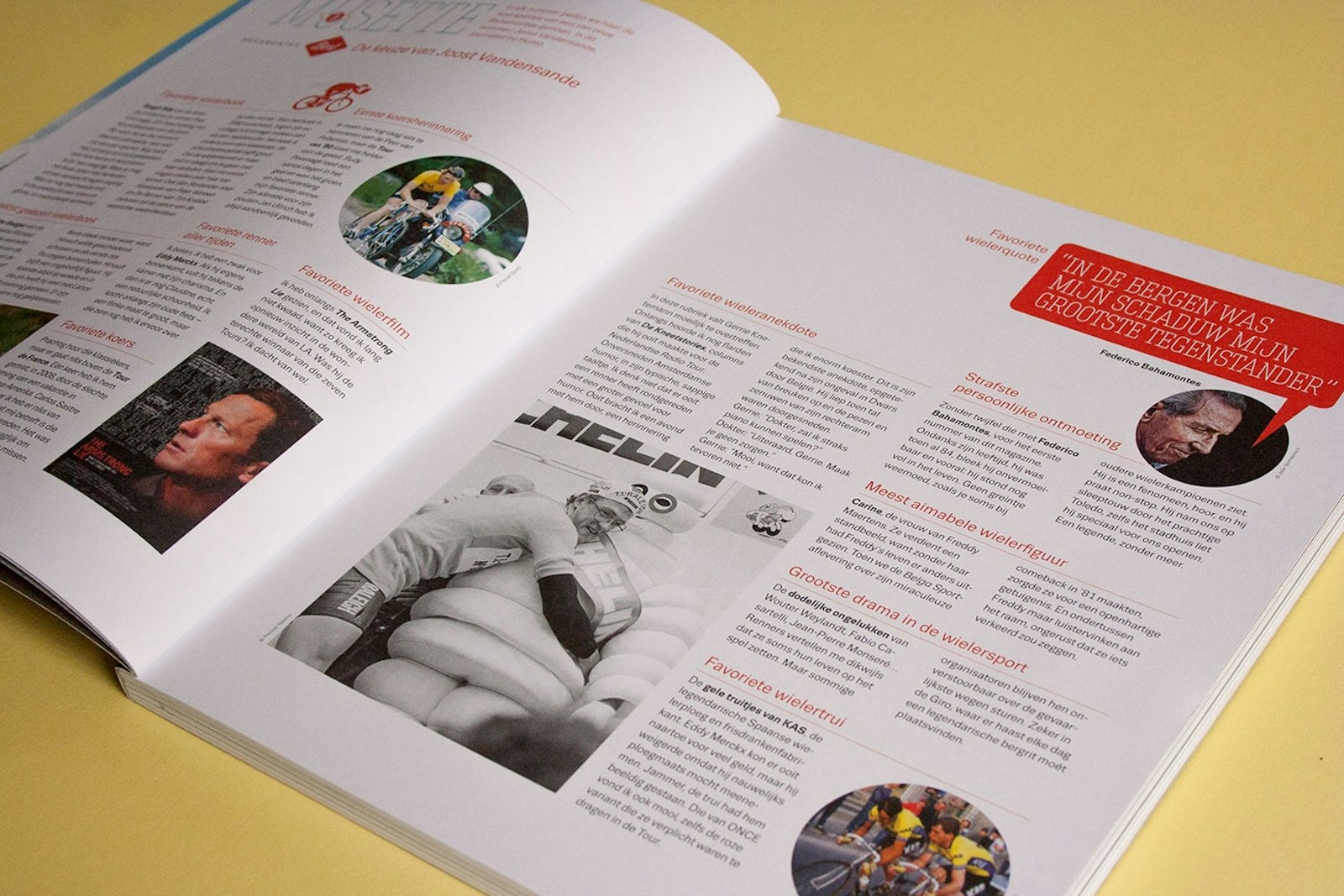
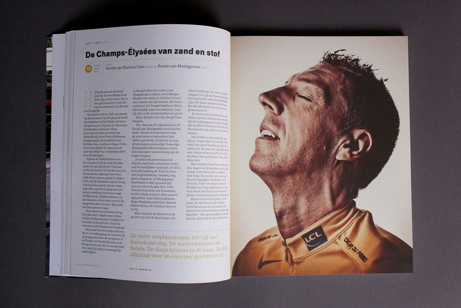
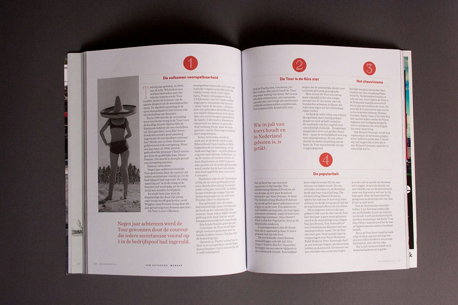
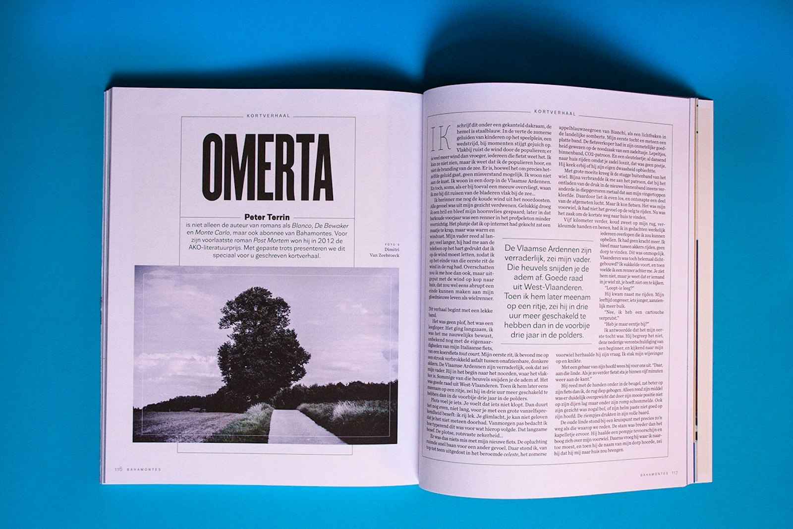
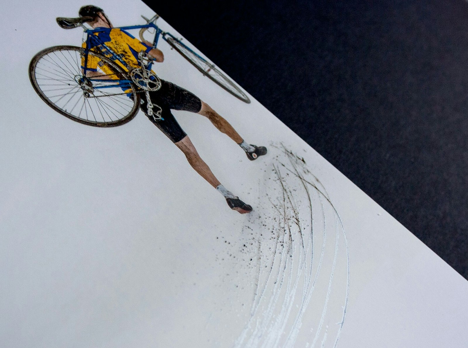
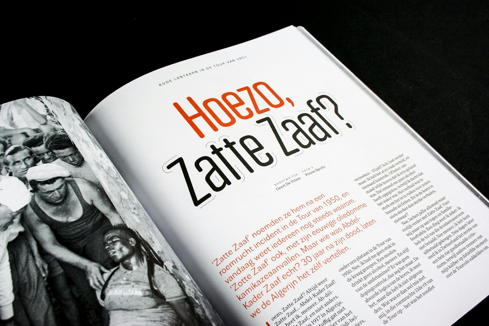
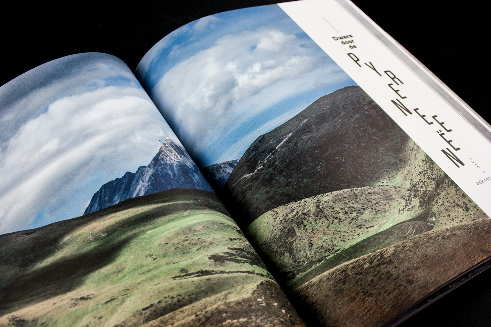
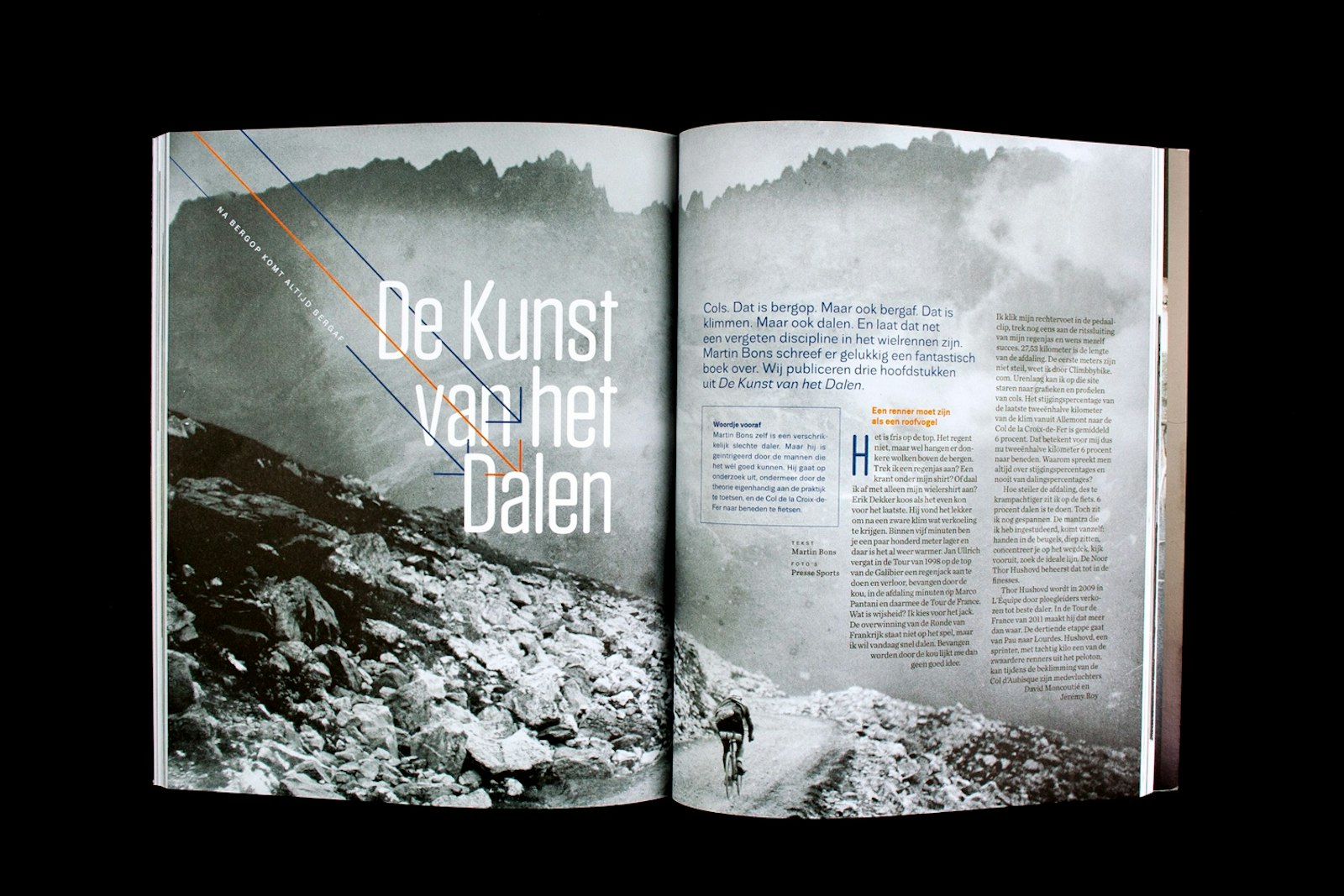
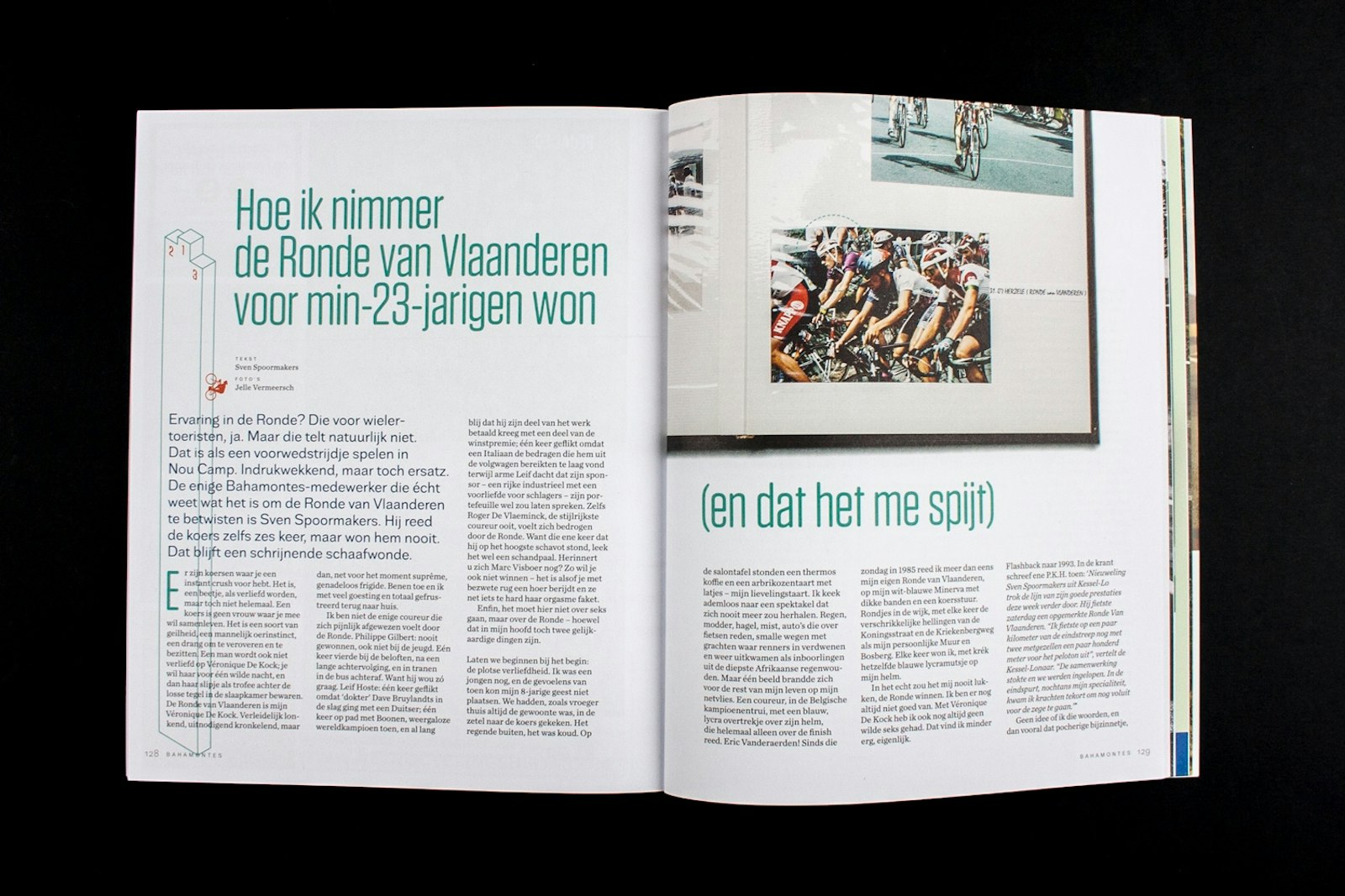
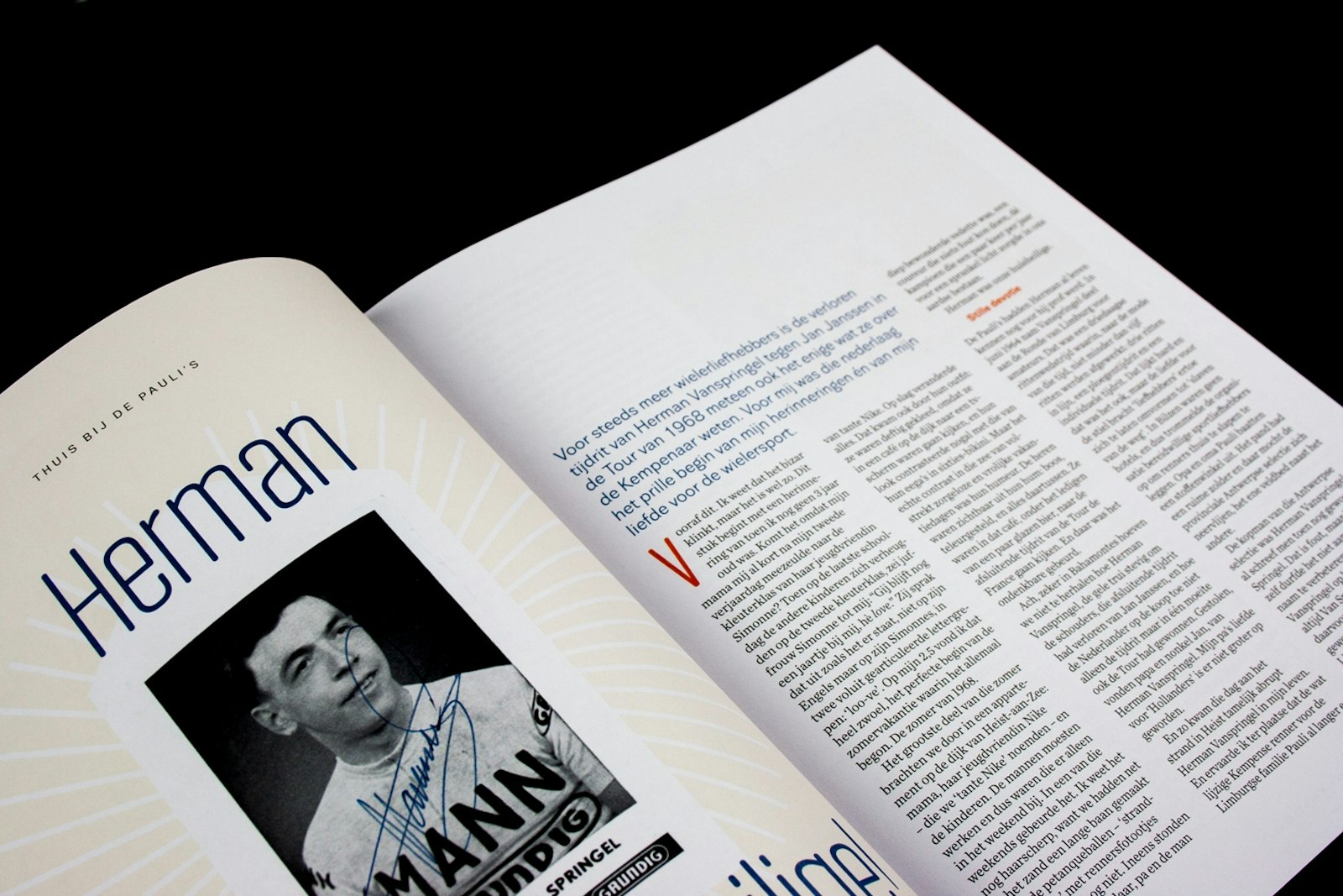
The magazine aims to give readers a relaxing and leisurely experience, and articles can easily be up to ten pages long. A given text frequently containing more than 23,000 characters, and there is plenty of room for large pictures.
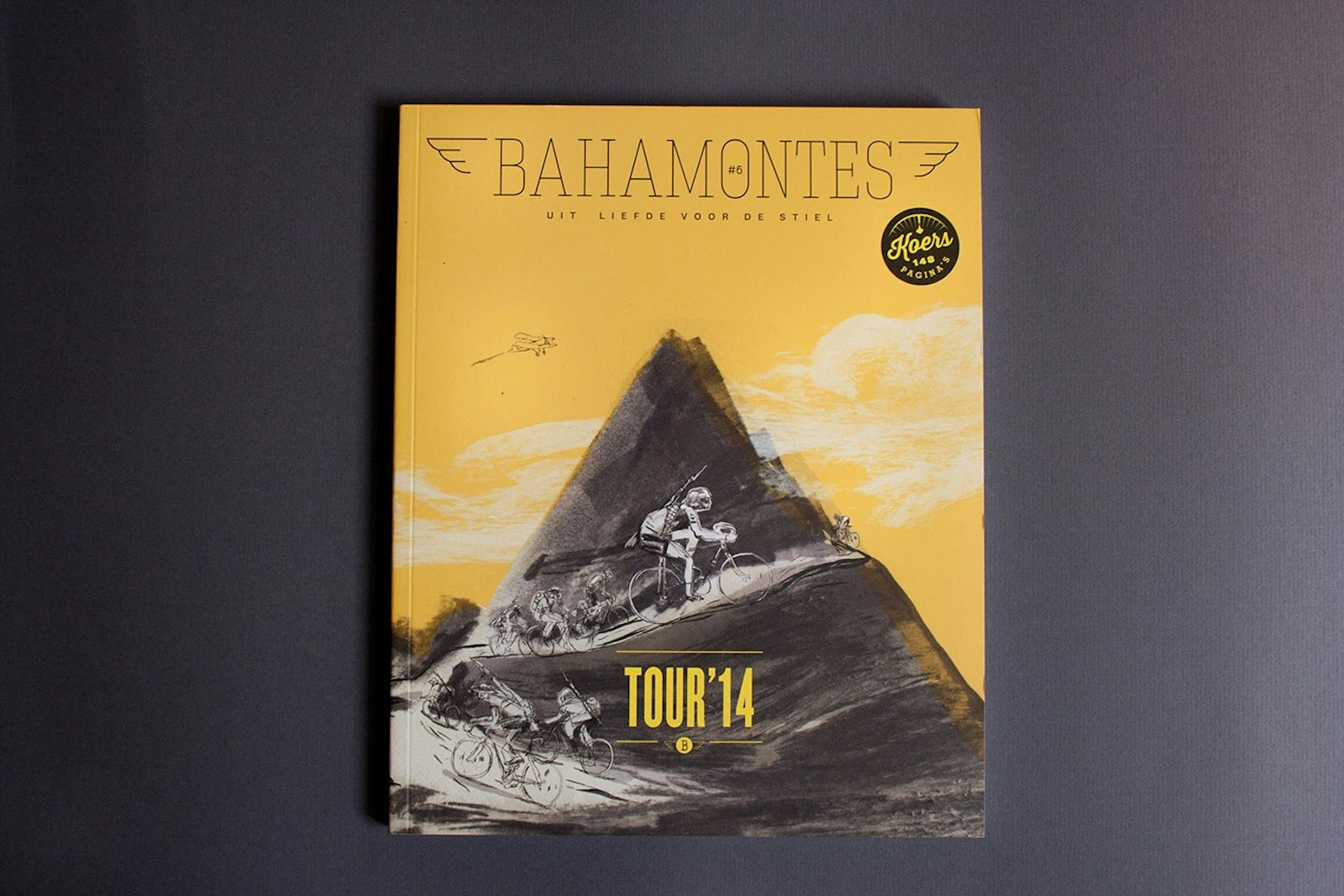
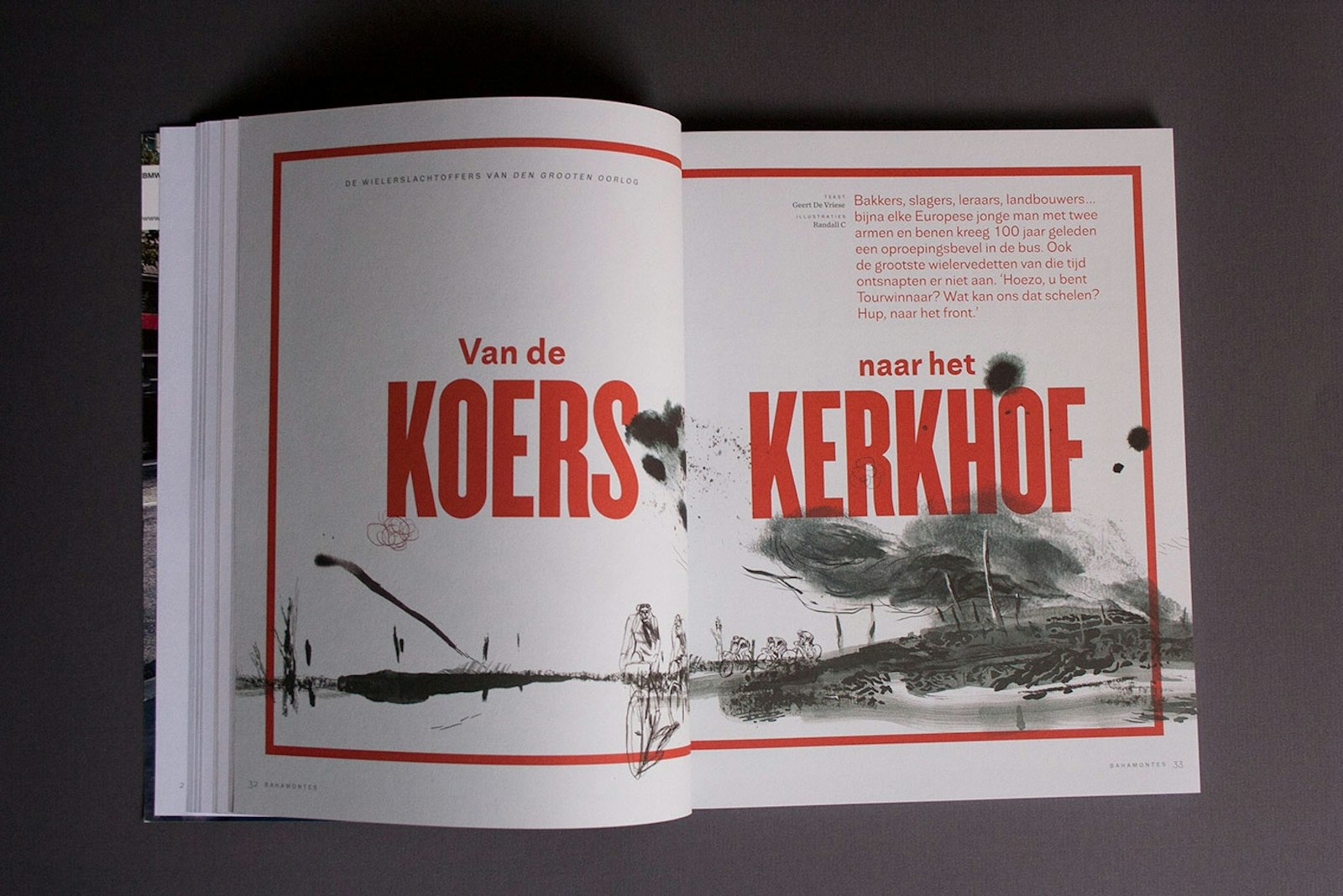
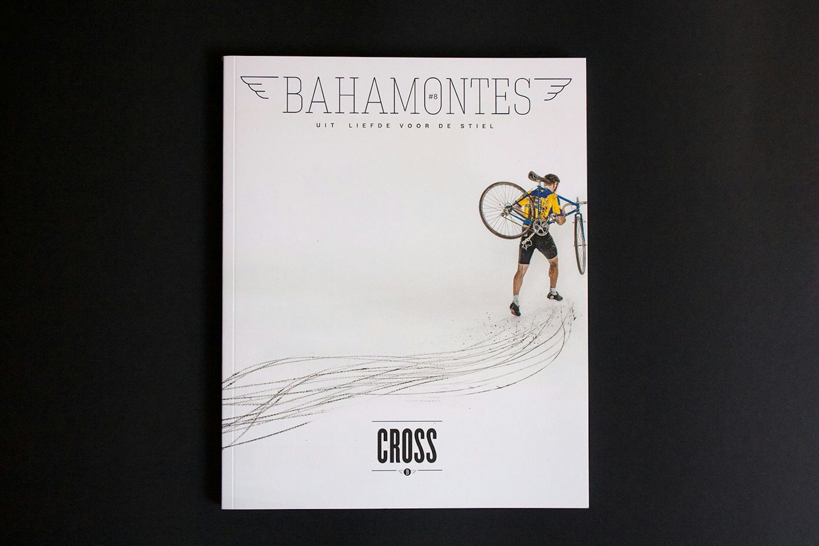
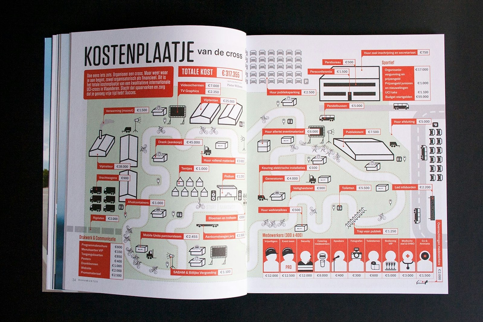
At the time of its launch back in 2013, Bahamontes was looking to distinguish itself from the other cycling magazines available: not only in terms of its content, wanting to seek out surprising and little known stories and subjects, but also as regards the staff it chose to hire. As a result, its articles are written by high-level journalists and feature plenty of space for imagery by renowned photographers and illustrators. Pieter Willems (Pjotr) has been responsible for the magazine’s graphic design since its inception.
In an increasingly competitive magazine market, Bahamontes has managed to engage a highly specific target reader group. The first issue was published in the spring of 2013 and since then its circulation has increased with every issue.
Bahamontes is published four times a year, is 144 pages long and is printed on uncoated premium paper.
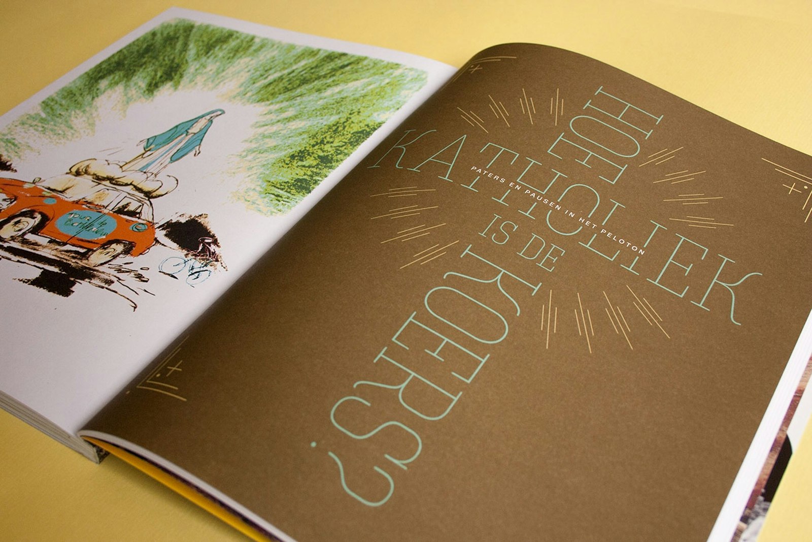
The design of Bahamontes is one of the magazine’s key components. Because opting for the best in every aspect was made a priority (in terms of journalism and photography), they’ve been able to fully dedicate themselves to the publication’s design down to the minute details, yielding fresh and unique content that at the same time is imminently readable.
