de Velde
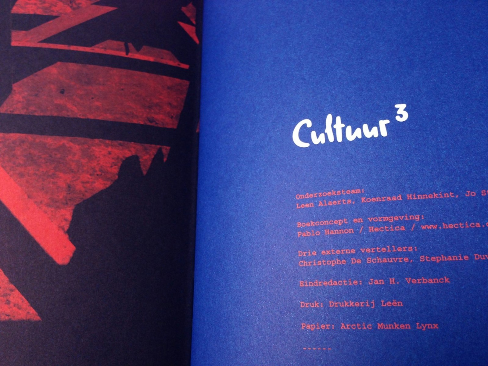
Cultuur3
Inspiration guide for the “bridge to Culture” project
They wanted to turn it into a strong product by coming up with a concept that was robust in terms of content and form. The book was a total concept in which the designer took care of the content’s structure, sought out and briefed the writers, conceived of the title, and handled the form, design and production.
The concept triptych was developed to create a book that communicates culture as it should: as a confusing journey with main roads and side roads, in which each reader can choose how he or she will reach that overall understanding of culture. Every element had to reinforce this concept.
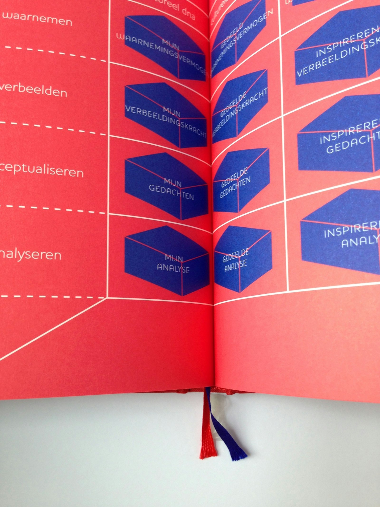
Two colours in the colour palette command attention and reinforce the separate “concept walk”. The book is made up of three parts: idea and theory; three short stories, each of which shows a part of the culture-awareness triptych in a different light; and finally, exercises to put theory into practice.
This is a non-linear book that walks you through many lessons and home exercises and allows you to discover its various layers. The book aims to deliberately confuse and push the reader on a voyage of discovery. This is how the designer arrived at the idea of two colours to reinforce the layers of typography and division. They create order, hierarchy, distraction, disruption, contrast and tranquillity.


