de Velde
Randoald Sabbe & Jan Hespeel
Looking at their first names you might think they had completely different personalities, but once you have made an acquaintance with them, you will know better: Randoald Sabbe and Jan W. Hespeel, who have formed an inseparable professional double act for the last two years.
Both graduated from Sint-Lucas in Ghent: Jan (born 1972) first in Graphic Design (1994) and then in Free Graphics (1997), and Randoald (born 1973) in Graphic Design (1997). Now they both lecture there. In this way they got to know each other and the other one's work better. Their collaboration started when, in 2004, Randoald asked Jan to work with him on a commission for the City of Antwerp (Museums of Antwerp Collection Policy).
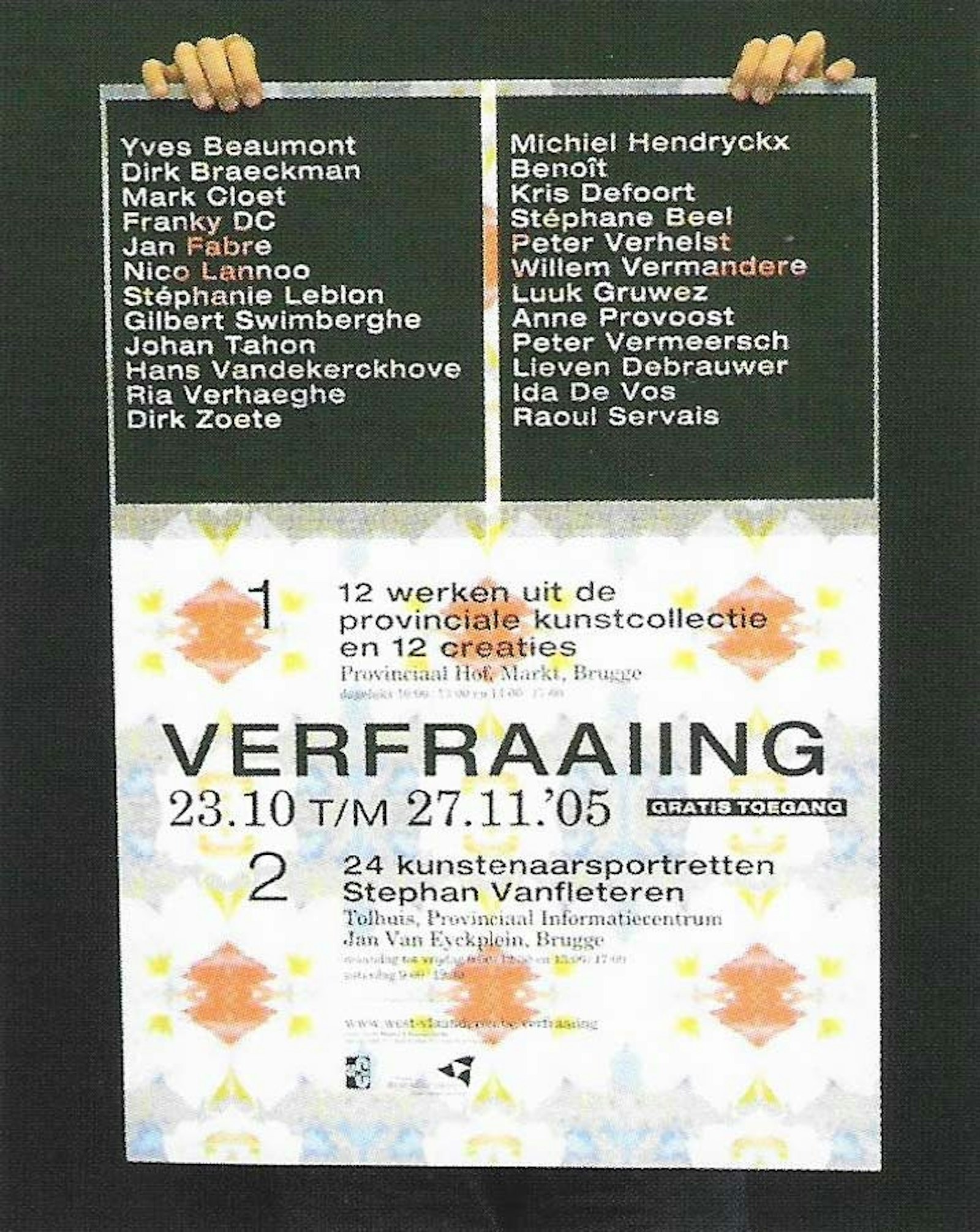
Randoald's role of house designer for the Akin House in Ghent since 1999 saw him being awarded the Cultural Heritage Prize for his easily accessible, vividly coloured, oval posters. With many other assignments behind him, for the likes of the Speeltheater/Kopergietery performing arts centre in Ghent, the culture magazine Pandoera, 'Het muziek Lod' (Ghent), the publisher Lannoo and Design Flanders, he already had a wealth of experience.
On the larger assignments (Het Toneelhuis playhouse in Antwerp) he often worked with another graphic designer, Peter van de Cotte. But because the latter had too many professional commitments, Randoald was on the lookout for a new partner, and quickly found one in the form of Jan Hespeel, designer, among other things, of the house style for De Kortrijkse Schouwburg [Kortrijk Theatre] (1998-2002) and for furniture designer Hans De Pelsmacker.
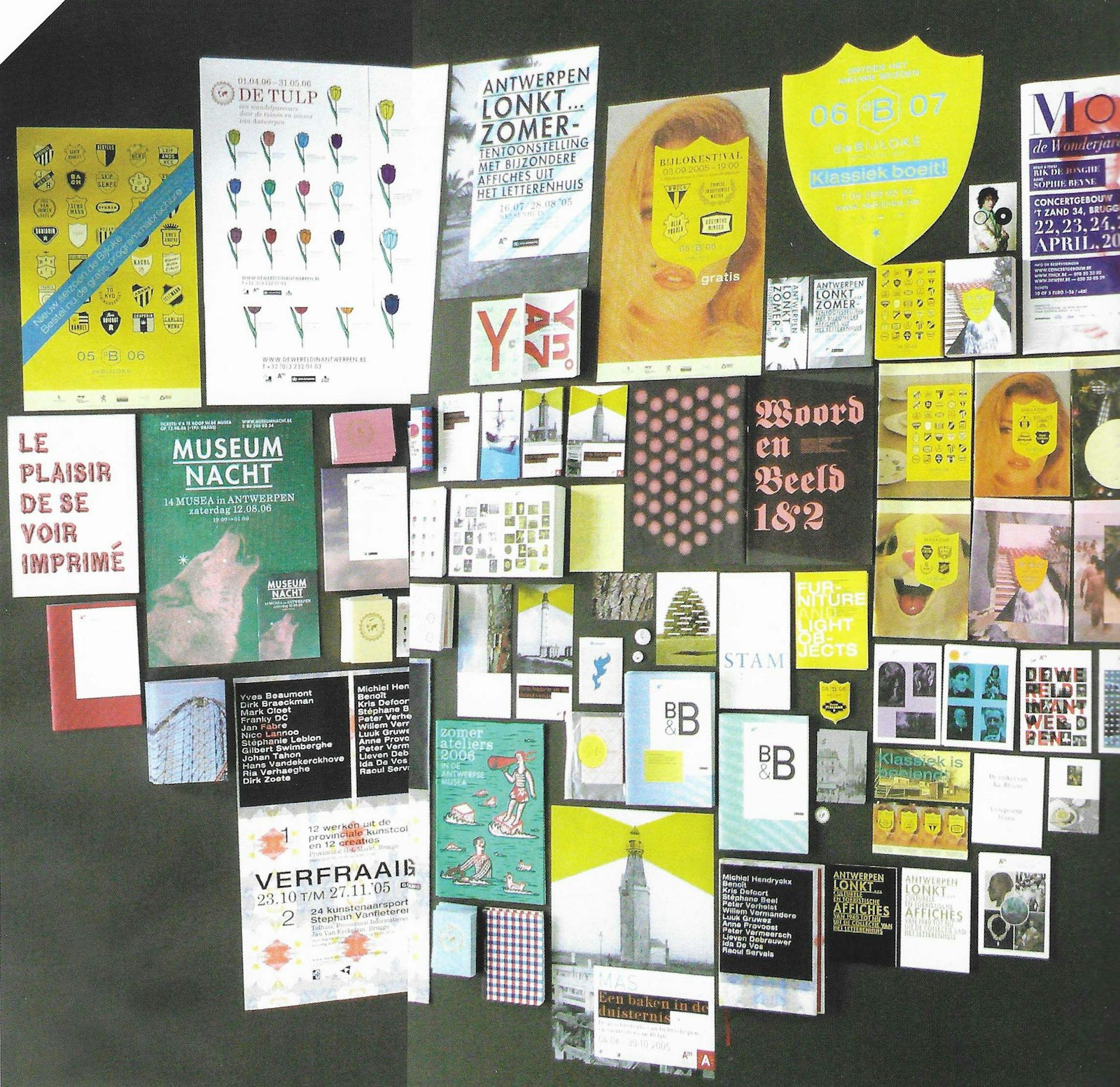
In Antwerp they were given the assignment because they had remained most faithful to Bruce Mau's logo for the Museums of Antwerp, and because their proposal showed an eye for typography and detail. They did not pay much attention to the house style rules, because they were too restrictive. They will respect a house style to a certain extent, but you have to be able to mould and remould it'. Fortunately, Antwerp's city and provincial museums have a partnership agreement, which allows plenty of room for manoeuvre in the house style rules.
The finished product always reveals obstinate imagination, well-conceived experimentation and communicative imagery, with a generous sprinkling of humour and relativity.
They share virtually the same vision to graphic design, and their approach to this is almost identical too, but there is a slight difference: Jan is more 'micro' in his work. He collects images in which he sees graphic potential for the theme, and is more concerned about the 'grid'. Randoald sees things in a more 'macro' manner, is more direct, starts looking for the solution to a problem right away and doesn't mind stepping away from the 'grid'.
But they are on the same wavelength. They have never disagreed, for example, about the choice of font. They see the partnership as positive, because they can always rely on feedback.
They relate in a very improbable manner, ordinary and natural, as in a 'game of football on the computer': 'we pass to each other constantly, until we get to the goal-mouth, then one lays it off and the other knocks it in'. It is a process of action-reaction, of association, in which they combine and organise a very large number of elements. For a specific example, they point us to one of their recent realisations: the Sint-Lucas Ghent Yearbook (2006), in which all the final-year students are shown under the theme life is a roller coaster'. The book looks crammed full and the principal's foreword comes at the end. Along with the photo taken especially for the publication, every student was given a sheet, literally and figuratively conceived as the calling card with which he/she steps into the world as a fresh graduate.
There is always a well thought-out system behind every design. 'Everything has to make sense, nothing is just for the sake of it'.
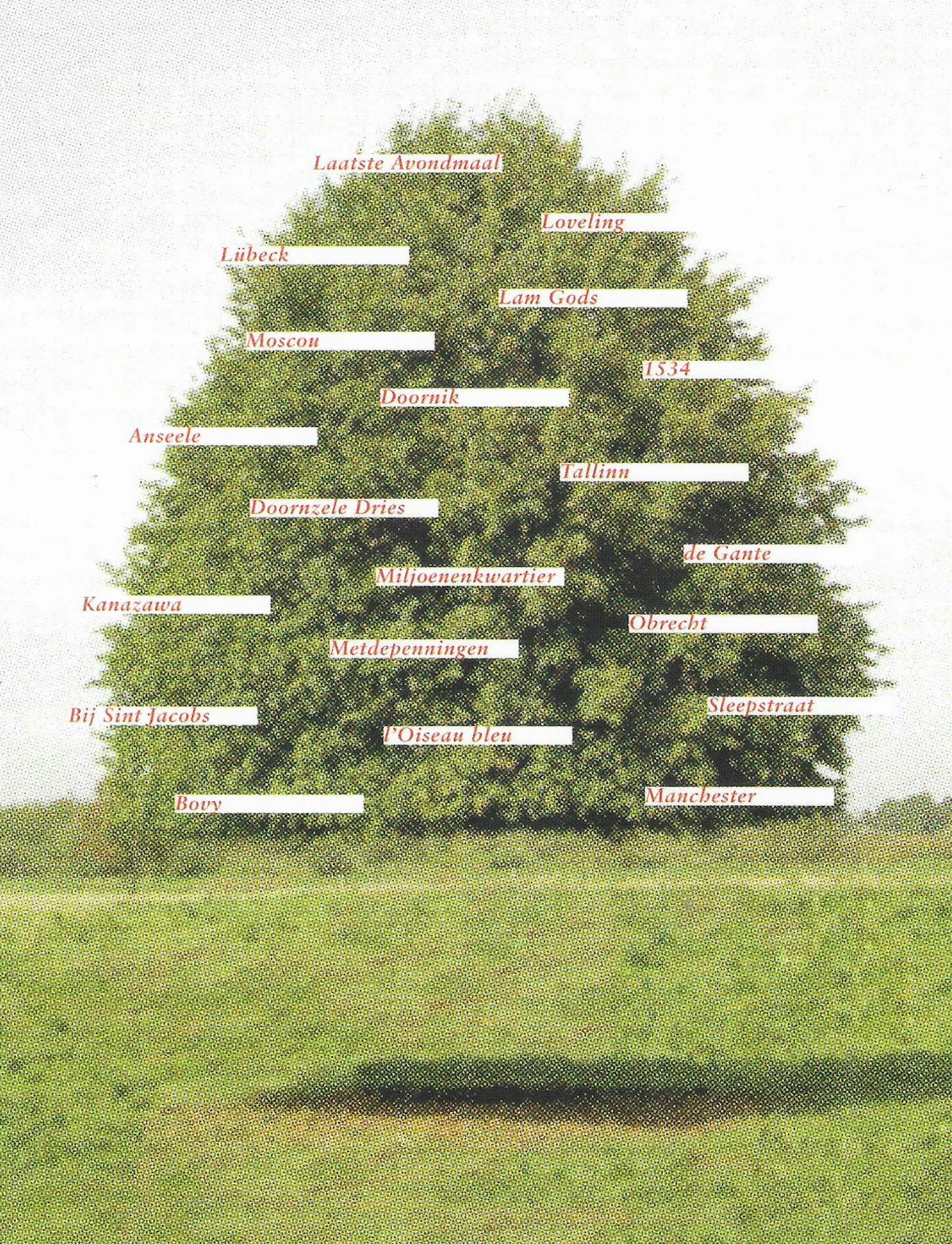
Their work is marked by a few constants, such as drawing on heraldic material, recuperating existing images from the Internet (usually rastered, because they are often only available in small size), going for older, proven fonts (Helvetica, Futura, New Century Schoolbook, Tiffany, Modern, etc.), using pure cmyk colouring (cyan, magenta, yellow, black). 'These can be printed perfectly and are easier to read,' they say. They look into how these colours work and what the press is capable of. They also experiment with paper: they are bringing a newsletter out for Sint-Lucas printed on 4 types of paper, and bundled, thus creating 16 different versions.
They consider the principal's input to the content extremely important. Also, with every new commission they stay just as alert to images and stimuli from the outside. With Randoald it usually comes all of a sudden, and Jan, when looking for ideas, tends to draw on his immense collection of heraldic shields, images, etc. Their strength lies in the logical use of 'building blocks' as they call them - they provide every project, particularly if it involves a series or a project with several elements, with a system of endless possibilities and portals, which keeps the whole thing fascinating and prevents them from coming to a dead end.
One very nice example of this is a recent job for 'De Bijloke', who wanted to attract a younger audience to their classical music concerts. Due to the tight budget it was decided to use cheaper paper, reminiscent of that used for the Yellow Pages, in the frisco colours of strawberry pink and pistachio green. To create a certain atmosphere they selected the shields of European football clubs, but replaced the 'contents' with portraits of the composers. Akin to a collage, they were combined in a grid with images plucked from the Internet. And so a story was born.
To date they have mainly designed posters, invitations, programmes, and other printed material with a life of one day to three months. In the future they hope to design more books and catalogues - more complex but much less transient.
